Assignment 3: THE BIG THAW MUST NOT HAPPEN
Project Start Date: September 2, 2008
Project Finish Date: September 9, 2008.
Project Manager: Kevin Tan Hock Kar
HP: 016-6369862
Email: K.Leonearz@hotmail.com
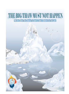
The Design Principles of My Poster
Line- I use Brush line to create rhythm of water for the Arctic Ocean and make it look more realistic.
Texture- The poster background has smooth texture. The Ice-Caps inside the poster have hard texture.
Shape- I draw the shape of the Ice-caps with harmony concept as the shape of my Ice-Caps are roughly the same. The difference of the Ice-Caps inside the poster is the size.
Tone- The shadows of the Ice-Cap inside the poster are made from different tones. The tone of the poster background (The Sky and Arctic Ocean) is shown by using concept of darker tone (bottom) to brighter tone. This is to indicate the dimension of background is balance and harmony.
Colour- The colour of the Ice-Caps is considerable contrast as I use a few different colours to make the Ice-Caps look realistic. The whole poster has a harmony colour feeling because the main colour of the poster is light blue, light grey and white. The whole poster also shows the feeling of unity because the colour of the Ice-Caps is about the same.

1 comment:
aLLouw....
I'm ochy,
froM indonesia.
wouLd u want to be my friend?
Post a Comment