Friday, February 27, 2009
Tuesday, September 9, 2008
The Final View Of My Poster and Design Principles
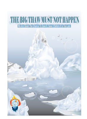
Assignment 3: THE BIG THAW MUST NOT HAPPEN
Project Start Date: September 2, 2008
Project Finish Date: September 9, 2008.
Project Manager: Kevin Tan Hock Kar
HP: 016-6369862
Email: K.Leonearz@hotmail.com
The Design Principles of My Poster
Line- I use Brush line to create rhythm of water for the Arctic Ocean and make it look more realistic.
Texture- The poster background has smooth texture. The Ice-Caps inside the poster have hard texture.
Shape- I draw the shape of the Ice-caps with harmony concept as the shape of my Ice-Caps are roughly the same. The difference of the Ice-Caps inside the poster is the size.
Tone- The shadows of the Ice-Cap inside the poster are made from different tones. The tone of the poster background (The Sky and Arctic Ocean) is shown by using concept of darker tone (bottom) to brighter tone. This is to indicate the dimension of background is balance and harmony.
Colour- The colour of the Ice-Caps is considerable contrast as I use a few different colours to make the Ice-Caps look realistic. The whole poster has a harmony colour feeling because the main colour of the poster is light blue, light grey and white. The whole poster also shows the feeling of unity because the colour of the Ice-Caps is about the same.
The Process of Doing My Poster
Before creating the poster, I planned for my poster layout first. The purpose of planning a layout is to create a well planned and organised poster. A good layout can make the poster more attractive and provide a great impact to people who see the poster.
Step 2-Making of the Poster Background
Firstly, I create the background of the poster first. I had split the background into 2 parts- The Arctic Ocean and The Sky.
I used rectangle tool to create 2 different rectangles. Then I coloured it using Gradient colour.
Diagram below shows the gradient colour that I used to colour the Arctic Ocean and The Sky.
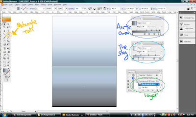
*I also created layers for my background.
Step 3- Starting to Draw an Ice-Cap with Symbol
Next, I started to draw the outline of the Ice-Cap (refer from my sketches) by using Pen Tool.
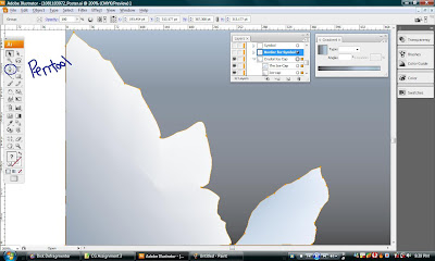
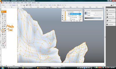
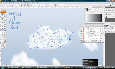
After that, I used Mesh Tool to create a 3D-look mesh lines. Then I adjusted the lines and matched it with colours which I think are suitable for Ice-Caps.
Finally, the first Ice-Cap is done.

I drew 2 oval shapes using ellipse tool and put them at the center of the Ice-Cap as shown in the diagram below. The purpose of doing this is I wanted to create a border for my Symbol.
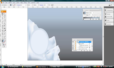
I placed the Symbol of Awareness at the center of the Ice-Cap. A symbol with a simple border and Ice-Cap at the back. Diagram below shows the complete view of the bottom left side of the poster.

Step 4- Drawing the Ice Ground with Ice-cap (Bottom Right side of the Poster)
I draw the outline of the Ice ground using Pen Tool.
After that, I combined all the layers into one group. I named the group layer as Ice Ground. Then, I use Gradient to match suitable colours for the Ice ground. Diagram below shows the gradient colours of the Ice ground.
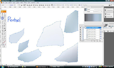
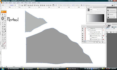
Next, I started to draw another Ice-Cap that is located on the surface of the Ice ground. As usual, I used Pen Tool to draw the outline of the Ice-Cap. This time I used a different method to create an Ice-Cap. I used combination method to create a realistic Ice-Cap. This means I drew different parts of an Ice-Cap first as shown in diagram below.
I used the Mesh Tool to create a realistic look for the Ice-Cap. Then, I rearranged the mesh line I put and matched the Ice-Cap with a suitable colour.
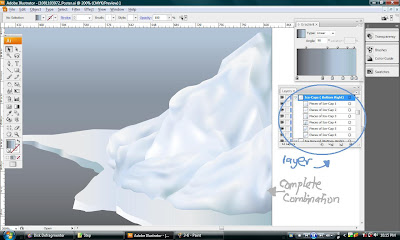
Final steps, I combined all the 6 pieces of Ice-Cap and arranged the suitable layer for each of the Ice-Cap. Diagram below shows the successful combination result of the 6 pieces of Ice-Caps .Now, the Ice-Cap looked very realistic and complete.
Step 5- Creating Ice Mountains and second Ice- Ground together
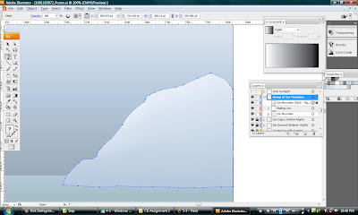
Next,I started to draw the outline of the Ice Mountain using Pentool.
After that, I use Mesh Tool to create mesh line inside the outline of the Ice Mountain. Then I readjusted the mesh line and inserted suitable colour for each mesh line as shown in
diagram below.

Used Pentool + Mesh Tool again, I created the melting Ice structure as shown in the diagram below.
Then,I added effect on the melting Ice,so that it will exactly look like the real melting Ice.
I select the EFFECTS> choose BLUR > select Gaussian Blur.
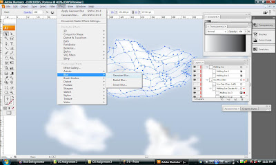
Then, it will come out a small box as shown in the diagram below. From the box, we can see the image after we adjusted the radius and also can magnify the view of the image. The more radius you put, the more blur the image become. In this case,I only needed to adjust the radius to 2.5 pixels and select OK.
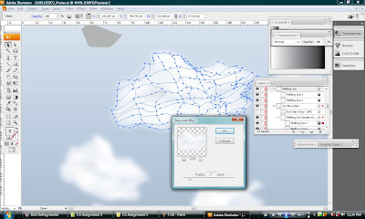
Diagram below shows the final view of the Melting Ice after adding the Gaussian Blur Effects.
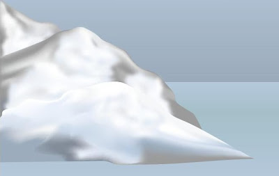
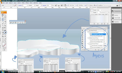
For the final steps, I recombined and rearranged all the layer of Ice Mountain and Melting Ice to form a complete view of Melting Ice Mountain as shown in the diagram below.
Now, to create another Ice Mountain, I used back the same method. As I mentioned, use Pentool to draw the outline of the Ice Mountain first.
Then, used Mesh Tool to add mesh line on the Ice Mountain, edit the mesh line again and match suitable colour.
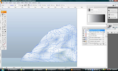
Diagram below shows the complete view of the Ice Mountain after editting with suitable mesh line and added with suitable colour.
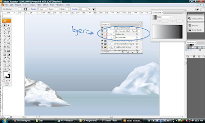
So, diagram below shows the final view of both the Ice Mountain in my Poster. And I adjusted and put labels and name for each layers.
Back to the same steps, I created another Ice- ground. The method is basically the same, use Pentool draw outline of Ice Ground and colour it using Gradient.
Diagram below shows the examples of gradient colour I used for my Ice Ground.
This is the final view of the Ice Ground.
Step 6- Creating A Giant Ice- Cap By Combination Method
All the diagrams below show the combination of 12 Ice-Caps into one Giant Ice-Cap. The method for doing this Giant Ice-Cap is also the same as previous methods.
Firstly, I used the pentool to draw the outline of each Ice-Cap. Then, I added the mesh line using Mesh Tool. Finally, readdjusted the mesh line and put suitable colour on it.
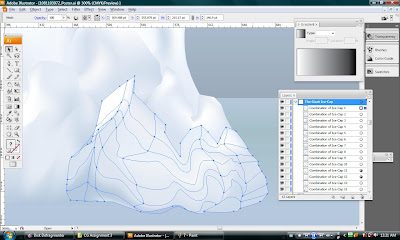
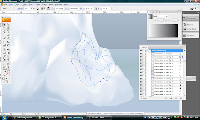


Diagram below shown another steps of using the Effects to create a melting Ice. By using the Gaussian Blur effects, and addjust the Radius. This is to make the image become blur.
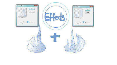
After that, I combined 2 of the images into 1. Now, the melting Ice is formed.
Final Steps, I combined all piece of Ice-Caps and melting Ice to form a Giant Ice-Cap as shown in the diagram below. Now, the Giant Ice-Cap looked very realistic and thanks for the helped of the Mesh Tool.
Step 7- The Birds
After I completed my Giant Ice-Cap and other Ice-Caps. Now is time for me to ilustrate and put some flying birds in my poster. The procedure is about the same with previous step. I draw the shape of the bird using Pen Tool and colour it using Gradient. The different is I created 4 layers part for each of the birds- Bird Eyes, Bird Wing, Bird Body,Bird Head.
Diagram below shown I put effects on the birds, so to make the birds looked not very clear. I used Stylize Effects on the Birds.
Select Effects> Choose Stylize> Click Feather.
After that, I adjusted the Feather Radius to 3pt for each of the Birds.
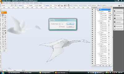
Diagram below shown the complete view of my Birds. I had put labeling for the Birds on my layers. 
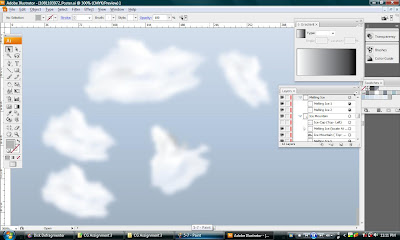
Step 8- Put some Small Ice-Caps (melting pieces) on the Arctic Ocean
After I created the Small pieces of Ice-Caps using Pentool and colour it using Gradient, I will put shadows for each of them.
Then method is very easy, by choosing Effects again, then select Stylize and click the Drop Shadow.
After that, a box shown in diagram below will appeared. I choose Multiply for the Mode, opacity 50 % and blur 7pt.
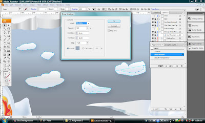
So, this is the final result after using Drop Shadow. ( As shown in Diagram Below)
Step 9- Make shadows for Ice- Caps and draw Water lines for Arctic Ocean
First, I create shadows for my Giant Ice-Caps by just copy the some of the Ice-caps from the Giant Ice-caps. Then, I reflect it vertical. I reduce it opacity to 65% and I choose the Gausian Blur Effects again.
I put the radius 7.0 pixels to make it more blur.

Diagram below shown the result after adding effects to the Ice-Caps Shadow.
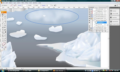
Next, I created Sea lines for my Arctic Ocean. The main function of Sea lines is too make the ocean looked nature, live and realistic...
First, I chose Paintbrush Tool and modified my ownself brush. Diagram below shown the brush styles that I had modified and used to draw Sea lines.
Diagram below shown the effects of Arctic Ocean after I drew Sea lines by using the brush styles that I had created just now.
After I put the Sea lines, I found that the lines is too obvious and clear. So, I used Transparency to reduce the colour brightness of the Sea lines. All I needed to do is just adjusted the opacity to 65%.
So, this is the finishing view of my Arctic Ocean after I added some Sea lines on it.
Step 10- Use Flare Tool to create Sunlight Effect
Next, I used Flare Tool to create the Light Effects for my poster. First, just click a suitable place to put the main core of Sunlight. While clicking the suitable place to put sunlight, we can addjust the size of the Sunlight.
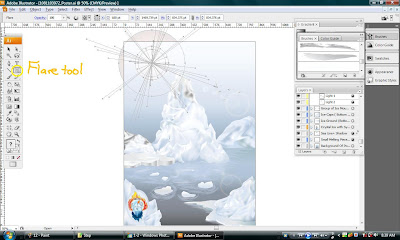
Secondly, click another place to show the path of light. (as shown on both diagrams below)
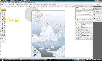

Finally, I had completed and succesfully make my poster more attractive...
Step 11- Final Steps, Put Texts ( Statement) on Poster
First,I used Type Tool to type out my statement.
 Secondly, I make outlines for my Texts (statement).
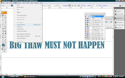
Thirdly, I used Scale Tool to enlarge and adjust my Texts until it looks suitable and can accurately fit into my poster.

After that, I decided to put pattern behind my Texts. So,I drag out one of the brush from Paintbrush Tool. I used Scale Tool to readjust it size. After that, I put is behind of my Texts.

Diagram below shown the final view of Texts for my poster.
Besides that, I used back the same method as above to type out another Texts ( Sub- Statement) for my poster. Then, I drew a rectangle and cover the Texts that I typed just now. Now, I used the Pathfinder and choose an Icon written " Exclude overlapping shades area". The result are shown in diagram below.

Diagram below shown the complete view of Texts for my poster.

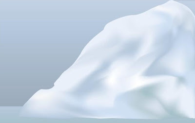
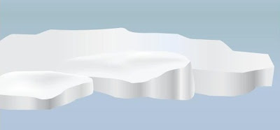
Wow, Finally I completed all the Steps... At last,I had completely done my poster !!!..
This is the final view of my poster... Phew, pretty cold man....
